Indentity & Packaging
subliminal wine
subliminal wine

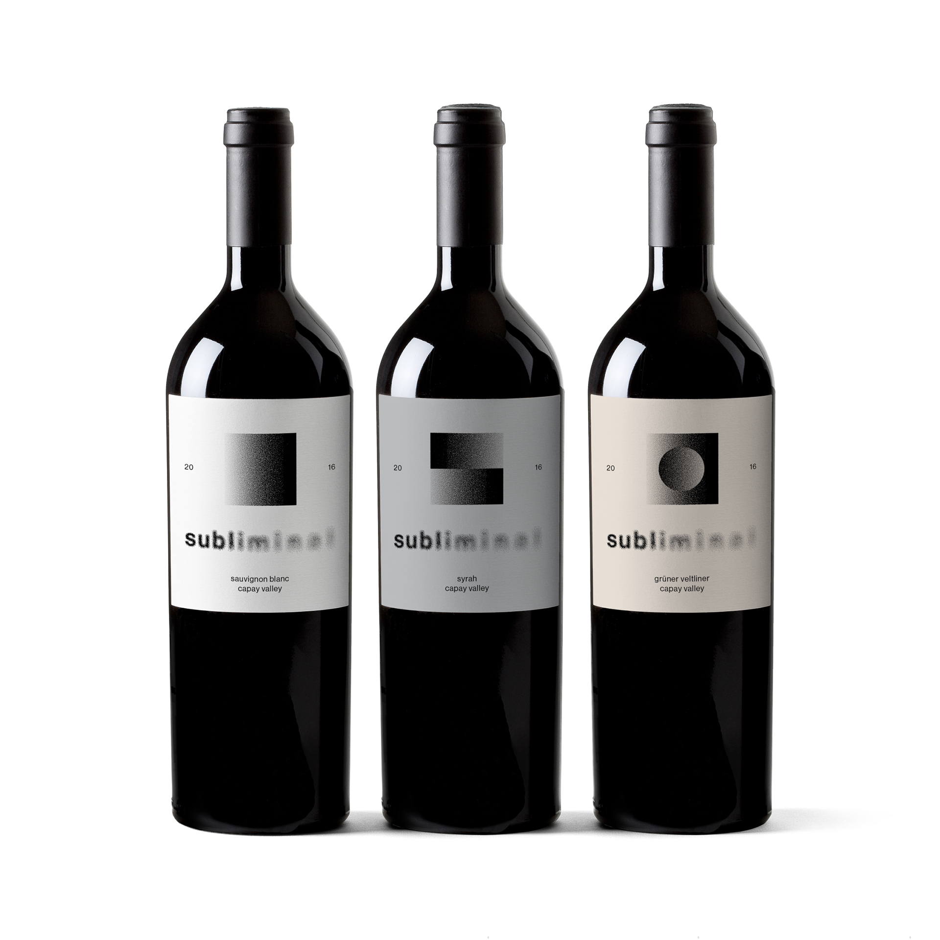


An expressive type treatment that embodies the word subliminal and makes connections to wine without being too literal. We see the first syllable clearly, and as we move through the word the clarity quickly dissolves and our minds are left to fill in the blanks. Legibility is maintained but still we are given a sense of the duality between the seen and unseen, the conscious and subconscious. The indirect nature of the treatment allows our minds to wander as to find our own subliminal meanings and connections. Where one person may see morning fog rolling over a vineyard, another might be reminded of the unique color shift and sediment that subtly differentiate one glass of wine from another.
The effect is created by the pulling apart and repositioning of nearly 7,000 clean vector dots. This not only insures that the wordmark is scalable and ready for many applications, but also adds a nice noise effect to the blur that interacts with the viewer, disappearing and reappearing depending on the viewing distance. The collection and sorting of the dots also adds another layer of complexity that draws connections to the sourcing and blending of grapes.
Services: Animation, Art Direction, Layout, Graphic Design, Typography
Services: Animation, Art Direction, Layout, Graphic Design, Typography